

Starting a business is an exciting journey, but true success depends on how you stand out. Your logo and branding are not just decorative elements but the foundation of your business.
The Power of Effective Logo Design for Business Growth
Your logo is the face of your business – it’s the first thing customers notice, shaping their perception of your brand.
It takes seconds to form an impression. A polished, well-balanced logo signals credibility, while a poorly designed logo can make your business appear unprofessional. Think of your logo as a digital handshake—it introduces your values and personality before you even speak.

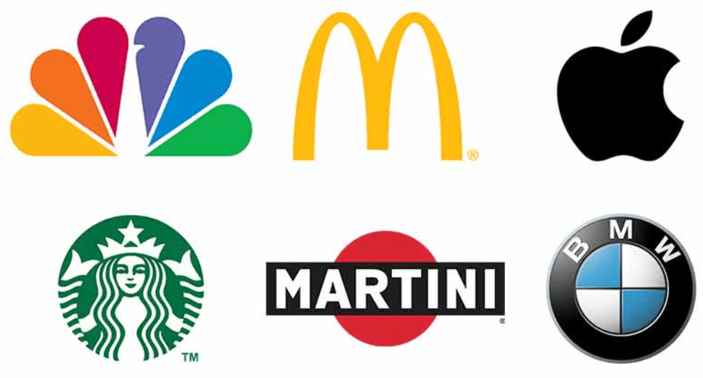
NBC: Colorful peacock logo with organized, radial symmetry. Each feather represents a network division, blending symbolism with visual harmony.
McDonald’s: Iconic golden arches—minimalist, bold, and universally associated with fast food. Red-and-yellow color psychology triggers appetite and joy.
Apple: Silhouetted apple with a bite—simple, scalable, and globally iconic. Neutral colors (monochrome) ensure versatility across mediums.
Starbucks: Clean circular frame with a simplified, recognizable siren icon. Balanced symmetry and limited color palette (green/white) ensure scalability and timelessness.
Martini: Sleek, minimalist design paired with bold typography, evoking sophistication and clarity.
BMW: Circular emblem with balanced quadrants and restrained typography. The monochrome-and-blue scheme conveys luxury and engineering precision.

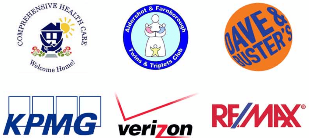
Comprehensive Health Care: Cluttered due to the lengthy name, small text, and generic cartoonish symbols that lack uniqueness and relevance to the brand.
Aldershot and Farnborough Twins and Triplets Club: Overly wordy, forcing cramped typography. Visual elements appear amateurish or overly literal.
Dave & Buster’s: The round, deformed typography warps the text into a circular shape, compromising readability and creating visual imbalance.
KPMG: Due to overly rigid serif font and with overlapping rectangular outline shapes makes it hard to read and it lacks of modern flair compared to dynamic competitors.
Verizon: Featured a cluttered “checkmark” symbol with gradient effects and tiny text. The design felt dated and visually noisy.
RE/MAX: Disjointed visual flow due to the slash and mixed casing. The cluttered composition lacks harmony, making it hard to read and diluting brand clarity.
Visual Identity Anchors Recognition
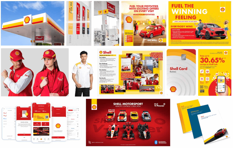
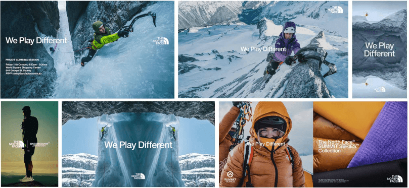
A well-designed company logo provides an immediate way for customers to remember and connect with your brand. Strategically using your logo, color scheme, and font choices consistently across all touchpoints builds familiarity, making your business instantly recognizable.
Imagine your logo (including its color palette and typography) at every part of your customer journey – from email signature, presentation, sales material, and website to printed materials and outdoor ads. Using these elements for months and years will build and stick in people’s minds and be associated with your product, service, and value.
Case in Point: Coca-Cola


Despite subtle updates to its logo since 1886, Coca-Cola has maintained core
elements like its iconic red color and distinctive cursive typography. Even as the logo evolved, this unwavering consistency across decades has solidified instant global recognition, anchoring the brand’s identity in public consciousness. By preserving these visual anchors through every iteration, Coca-Cola demonstrates how long-term commitment to cohesive branding fosters enduring recall, emotional connection,
and lasting value.
Build Trust Through Design
Customers often judge a brand’s credibility and competence based on its visual identity. A polished, professional logo signals attention to detail, expertise, and stability, which fosters subconscious trust. This psychological link—aesthetic appeal and reliability— encourages customers to feel emotionally secure in choosing a brand, especially in competitive markets where first impressions matter.
BRAND FOCUS Apple


Apple’s minimalist logo and cohesive design language consistently communicate sophistication, innovation, and reliability. The logo’s simplicity, sleek product design, and clean marketing materials reinforce the perception of Apple as a trustworthy, premium brand. This intentional design consistency has helped build a loyal customer base that associates Apple with quality and cutting-edge technology.
Key Design Elements That Build Trust:
- Clarity: Apple logo’s lack of clutter conveys clarity and confidence.
- Consistency: Uniform use of monochrome or metallic finishes across devices and branding signals precision.
- Emotional Resonance: Apple logo’s association with user-friendly, intuitive products fosters a sense of security and dependability.

Memorability Drives Recall
A logo is more than just a visual mark—it’s a cognitive shortcut for your brand. When designed with memorability in mind, it becomes a mental trigger that ensures your brand stays front and center in customers’ minds. Here’s how simplicity and distinctiveness work together to fuel recall and loyalty:
Simplicity
The human brain processes simple visuals faster and retains them longer. A clean, uncluttered logo eliminates cognitive “noise,” making it effortless to recognize and remember.


Example: Amazon’s Smile Arrow
Amazon’s logo pairs a clean, minimalist wordmark with a subtle arrow stretching from “A” to “Z.” The arrow doubles as a smile, symbolizing customer satisfaction and the idea of “everything you need.” Its simplicity ensures legibility at any scale, from mobile screens to delivery trucks.
- Why it works: The arrow’s dual meaning creates subconscious associations (completeness + happiness) without clutter. The lack of complex graphics makes it globally recognizable, even in monochrome.
Distinctiveness
A memorable logo must be unique enough to avoid blending into competitors’ designs. Distinctive elements—like a bold color, unexpected shape, or clever negative space—create a “mental hook” for your brand.


Example: FedEx’s Hidden Arrow – The subtle arrow between the “E” and “x” symbolizes speed and precision. This small detail differentiates it from generic logistics logos and sparks curiosity.
- Why it works: Distinctiveness breeds ownership. When a logo is one-of-a-kind, competitors can’t replicate its essence without seeming like copycats.
Recall
When a logo is both simple and distinct, it lodges itself in long-term memory. This primes customers to think of your brand first when they’re ready to buy.


Example: WWF’s Panda
The World Wildlife Fund’s panda logo uses stark black-and-white shapes to depict the animal’s face, leveraging negative space for simplicity. The panda is both an endangered species and a universal symbol of conservation, tying the logo directly to the brand’s mission.
- Why it works: The emotional weight of the panda (a “charismatic” endangered animal) lodges the logo in memory. When people think of wildlife protection, the WWF panda surfaces instantly, driving donations and engagement.
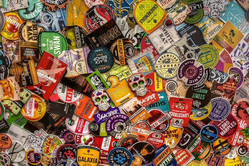
Can you guess the brand names of these logos?


Complete Brand Identity: Building Trust and Recognition
A logo is just the start. Complete branding encompasses colors, typography, messaging, and tone—all working together to tell your story.
How to build trust with visual design
Use the same brand identity on business cards, websites, and marketing materials to create a seamless customer experience. This means using the same brand colors, font, and messaging on all your platforms and customer touchpoints.

Drive Loyalty through Emotional Connection
Colors, fonts, and imagery evoke emotions. Warm tones convey comfort and approachability, while bold fonts suggest innovation and creativity. Strategic branding taps into these emotional triggers to create connections with customers.

Did you know?
Major brands use color psychology to influence customers. For example, the color red evokes passion, excitement, and energy. On the other hand, the color blue is a calming color and symbolizes trust, peace, and security.


Stand Out in a Sea of Sameness
You must tell a consistent and compelling story to unleash your brand’s uniqueness. Begin by identifying what makes your business different. Then, use those insights to create a cohesive visual narrative.
Select colors, typography, and imagery that look seamless while accurately conveying your brand’s essence. Develop a clear, unique value proposition and supplement it with a portfolio or case studies, if possible. This approach will add credibility to your brand.
Craft a Brand for the Future
When creating your brand identity, always leave room for growth. A well-crafted brand strategy allows expansion without losing your core messaging. Your brand should remain relevant as you launch new products, expand into new markets, or evolve your business.
Investing in branding isn’t an expense—it’s a growth accelerator.
It takes a lot of work, time, and introspection to create a brand identity – and even more effort building the brand assets. We work with startups and small businesses who need help with brand and marketing. Leave the work to us so you can focus on growing your business.
Why Choose Creative Design+?
We solve your design and marketing challenges. We offer affordable logo design services and brand strategy for small businesses tailored to your vision and audience.
The best part? You get agency-quality designs at affordable prices – no lock-in commitments and hidden charges. Top-tier quality projects delivered fast.
All logos, brand names, and trademarks displayed here are the intellectual property of their respective owners. Their use does not imply endorsement, affiliation, or sponsorship by the brands/companies mentioned. These logos are included solely for identification and illustrative purposes under fair use principles. Creative Design+ claims no ownership over third-party trademarks or imagery.